


Adding error bars in Excel helps make charts more accurate and professional by showing possible variation in data values. Whether you are creating scientific graphs, business reports, research charts, or statistical analysis, error bars help explain uncertainty and improve data visualization. Many students, analysts, and researchers use Excel error bars to present reliable results clearly.
Modern Excel charts now support custom error bars, standard deviation calculations, scatter plot error bars, and statistical data analysis tools. Learning how to use error bars correctly can improve chart readability and make your spreadsheets look more advanced and trustworthy.
What Are Error Bars in Excel?
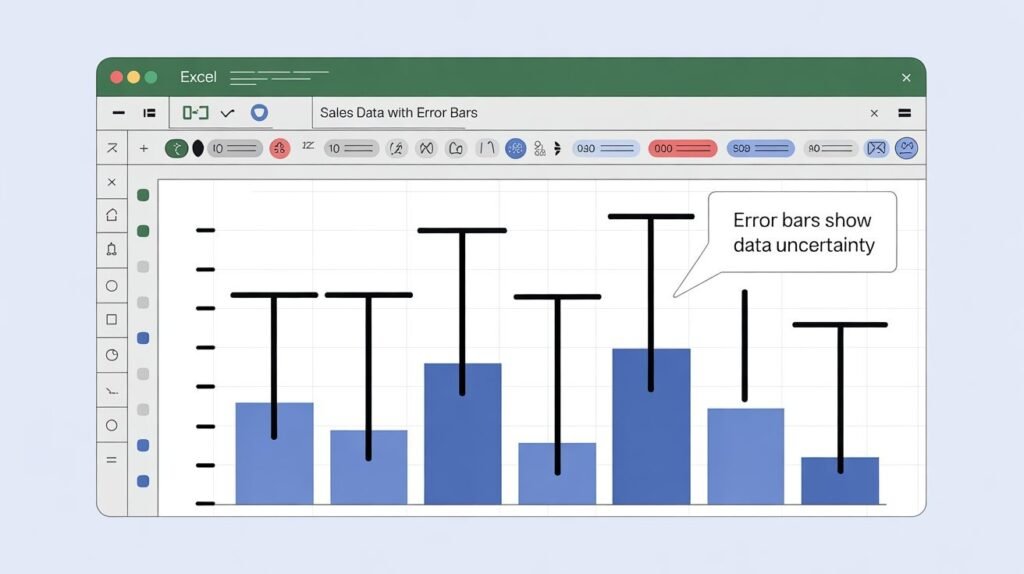
Error bars in Excel are graphical lines added to charts that show variability, uncertainty, or possible error in data values. They help viewers understand how much data points may differ from the average value. Error bars are commonly used in scientific reports, statistical analysis, engineering graphs, and research presentations.
Excel allows users to apply standard deviation, percentage, standard error, or custom values as error bars. These chart elements make data interpretation easier and help explain trends more accurately in visual reports.
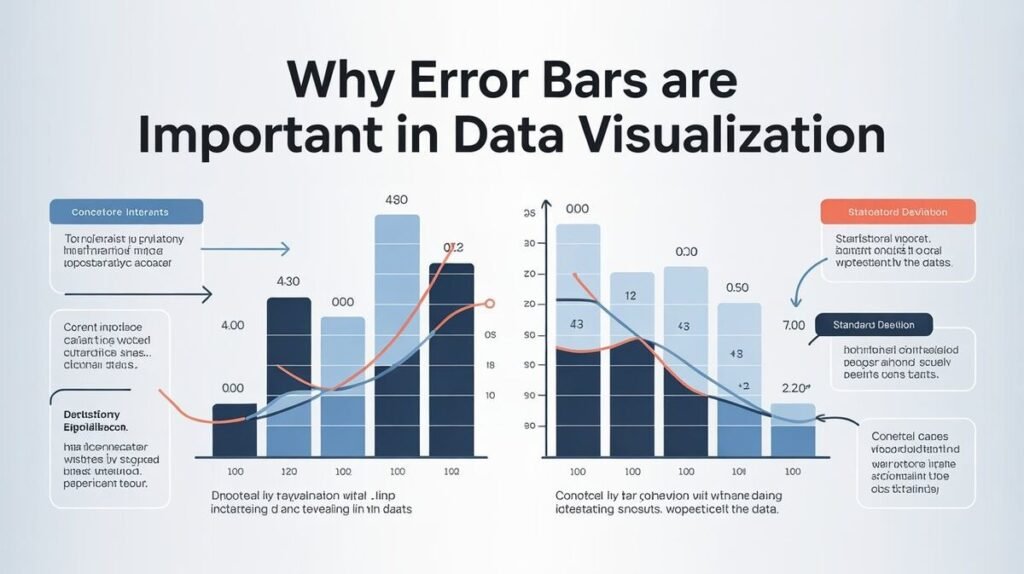
Why Error Bars Are Important in Data Visualization
Error bars improve chart accuracy because they visually represent data consistency and variation. Without error bars, charts may look overly precise even when real-world data contains fluctuations or uncertainty. This is why researchers and analysts often use them in reports and presentations.
Well-designed Excel charts with error bars also look more professional and informative. They help businesses, students, and scientists communicate complex information clearly while improving confidence in statistical results.
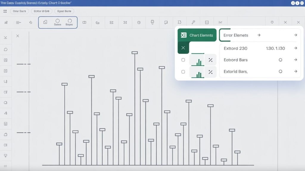
How to Add Error Bars in Excel
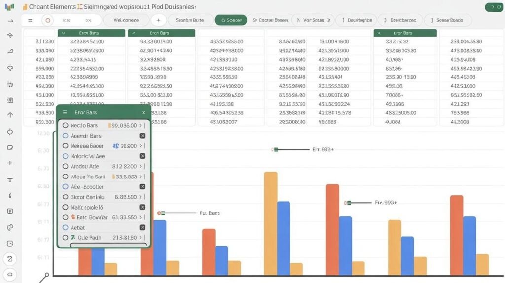
Sometimes users need different error values for each data point instead of one standard value. Excel allows this through custom error bars. Select the chart, open “Format Error Bars,” and choose the “Custom” option under error amount settings.
You can then manually select cell ranges containing positive and negative error values. This method is commonly used in scientific data analysis, laboratory experiments, and advanced statistical reporting where each data point has unique variation.
How to Add Error Bars in Excel Line Graphs
Line graphs often use error bars to show fluctuations across time or measured observations. To add them, first create a line chart and then enable error bars from the chart elements menu. Excel automatically places the error indicators above each data point.
Customizing line graph error bars improves chart readability and makes trends easier to analyze visually. Many researchers use this feature when presenting growth trends, survey results, or performance analysis reports.
How to Add Error Bars in Excel Scatter Plots
Scatter plots are one of the most common chart types for error bars because they compare variable relationships and statistical spread
Scatter plot error bars are widely used in scientific research, engineering reports, and mathematical analysis. They help explain data reliability and improve overall chart interpretation.
How to Add Error Bars for Standard Deviation
Standard deviation error bars show how much data varies from the average value. In Excel, click the chart, select Error Bars, and choose “Standard Deviation” from the available options. Excel automatically calculates the deviation using your dataset.
This method is commonly used in academic research, finance reports, and business performance tracking. Standard deviation error bars help viewers understand whether data points are closely grouped or widely spread.
How to Add Error Bars on Mac
For Mac also supports error bars through chart customization tools. Users can select a chart, open chart design settings, and add error bars from the formatting menu. The process is similar to Windows versions, although some menu locations may differ slightly.
Mac users can still apply custom error values, standard deviation settings, and advanced chart formatting features. This makes Excel on macOS useful for professional data analysis and presentation work.
Common Excel Errors Users Should Know
Besides chart-related issues, Excel users often encounter formula and spreadsheet errors. Common Excel errors include #DIV/0!, #VALUE!, #NAME?, #REF!, and #N/A. Understanding these errors helps improve spreadsheet accuracy and troubleshooting skills.
Learning both chart customization and Excel error handling improves overall spreadsheet efficiency. This is especially important for analysts, students, researchers, and office professionals working with complex data.
Tips to Make Excel Look Professional
Professional Excel charts should remain clean, readable, and visually balanced. Avoid using overly large error bars that clutter the chart or make trends difficult to see. Choosing consistent formatting and proper chart labels improves overall presentation quality.
Using color contrast, readable axis labels, and organized datasets also enhances data visualization. Small design improvements can make Excel reports look more polished and easier for audiences to understand.
Final Thoughts
Learning how to add error bars is an important skill for anyone working with charts, reports, or statistical analysis. Error bars help explain uncertainty, improve chart accuracy, and make data visualization more professional and informative.
With proper formatting and customization, your charts will look more reliable, organized, and visually effective.
FAQs
In Google Sheets, create a chart, open the chart editor, go to Customize, and enable error bars from the series section.
How to add error bars in Excel 2026?
The process is similar to earlier versions. Select your chart, click Chart Elements, and enable Error Bars from the customization menu.
How do I add individual error bars?
Use custom error bar settings in Excel and manually select separate positive and negative error value ranges.
What are the 5 types of Excel errors?
Common Excel errors include #DIV/0!, #VALUE!, #REF!, #NAME?, and #N/A.
Can I add error bars to scatter plots in Excel?
Yes, Excel supports both horizontal and vertical error bars in scatter plot charts for advanced data analysis.